Passepartout border width and opening positions explained
In addition to color, the width of the mat borders and the associated opening positioning play a crucial role in the visual impact of an image. The border dimensions not only determine how much space the image receives but can also influence its overall effect. By choosing the right proportions and thus determining a harmonious position for the opening, you ensure that the motif, mat, and frame are in perfect harmony.
Why Border Widths Are So Important
The passepartout is not only a spacer between glass and image, but also a visual design element. With narrow borders, the image appears more modern and minimalist, while wide borders convey calm and quality. A balanced width ensures that the motif does not appear “overwhelmed” while having enough space to shine.
Rules of Thumb for Mat Borders?
Unfortunately, there is no universal rule of thumb for the perfect mat border dimensions. It always depends on the artwork to be framed, the chosen frame profile, and ultimately, especially on personal taste.
If you have no idea what suitable border dimensions might be, you can initially use the “5/5/5/7” rule as a guide. This states that the borders on the right, left, and top should each be 5 cm, with 7 cm for the bottom border. Use our generator for custom passepartouts to view the proportions of your passepartout and perhaps experiment a little.
Our tips for you – how to choose the right Passepartout border width and opening position
- Keep in mind that the frame profile will overlap the sides of the mat, thus encroaching slightly on the visible area of the mat.
- For multiple openings, for aesthetic reasons, the bridges between the openings should ideally not be larger than the visible border dimensions of the mat. Again, remember that the frame profile will cover some of the mat.
- The mat often offers wonderful opportunities to freely determine the frame size, as it serves as an intermediate element from the image to the frame. From a cost perspective and for more practical handling, it is usually advisable to work with a standard frame. This technique works in many cases, but there are also image formats where a custom frame is indispensable due to proportions not matching standard frame sizes.
- Utilize the advantages of our online generator. Here you can view mats to scale and check the proportions. Sometimes it also makes sense to play with the dimensions and test different variations.
Symmetrical or Asymmetrical?
Many passepartouts are cut symmetrically, so that the opening is centered in the passepartout and the border dimensions at the top and bottom, as well as left and right, are chosen to be equal. This approach is particularly useful when it is not yet clear whether you want to frame images in portrait or landscape format with the passepartout. Furthermore, this approach allows you to keep the option open to repurpose the passepartout at a later time. However, for a particularly appealing appearance and long-term framing, the general recommendation is to work with the so-called “optical center” and choose the bottom border slightly wider.
What is the Optical Center?
The optical center is a point in design that lies slightly above the actual, geometric center. Since the human eye tends to perceive an exactly centered object as being placed too low, shifting it upwards creates a more balanced, harmonious visual impression. This so-called raising of the opening thus ensures that the image does not optically slide down within the frame.
The choice of the correct mat arrangement often depends on its intended use:
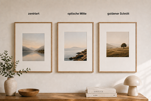
- Centered: Ideal for large editions or when it is not yet determined whether the motifs will be framed in portrait or landscape format. The symmetry provides flexibility.
- Golden Ratio: Particularly suitable for square openings in portrait format. This ratio creates harmony and appears very balanced, especially for artistic works.
- Optical center: The best choice for classic framing, both for portrait and landscape formats. The slightly wider bottom border makes the framing appear more high-quality and the framed work sits visually “correctly” in the passepartout.
This allows you to quickly find the right solution depending on the image format and presentation goal.
Effect of Very Wide Borders
Very wide borders can give an image a special expressiveness. They provide the artwork with room to breathe and draw the eye even more strongly to the motif. In art and photography exhibition practice, wide mats are often used to emphasize exclusivity and professionalism.
Practical Tips
- Always choose mat border in relation to image size.
- Better slightly too wide than too narrow – it looks more valuable and elegant.
- The bottom border can deliberately be chosen larger.
- For exhibitions or high-quality presentations, mats with wider borders are standard.
Conclusion: The right Passepartout border width and opening position create balance
The width of the mat border and the positioning of the opening significantly contribute to the overall effect of the frame. The right proportions between the image, mat, and frame create a harmonious unit that perfectly showcases the artwork.
Provided it is clear whether the mat will be used in portrait or landscape format, you should consider raising the opening to the optical center. However, with a centered opening, you can use the mat more versatilely for changing content, both in portrait and landscape format.