Choosing a Passepartout Colour – Which Shade Suits Your Image?
The choice of passepartout colour has a decisive influence on how an image appears. While the passepartout may initially seem like a simple cardboard frame, it is in fact a powerful design element: it directs the eye, enhances contrasts, and can completely transform the mood of a work of art.
The basic rule is: The passepartout should support the motif, not overpower it. If the colour becomes too dominant, it pushes the image into the background.
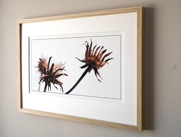
Light Passepartouts – Subtle and Classic
White or cream-coloured passepartouts are the classic choice. They suit almost any motif and ensure a calm, understated presentation. Light tones are a safe choice, particularly for photographs, watercolours, and printed graphics.
Dark Passepartouts – Depth and Contrast
A dark passepartout colour enhances the visual impact by creating depth. It can make light motifs appear more luminous and is particularly suitable for photographs with strong colours or black-and-white images. However, dark tones should be used sparingly, as they can quickly become dominant.
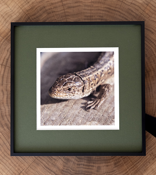
Coloured Passepartouts – Accents with Impact
A coloured passepartout can be used to deliberately enhance moods. A warm red or yellow emphasises lively scenes, while blue or green tones can have a calming effect. Strong contrasts can also be created through targeted colour selection. It is particularly effective, however, when the passepartout picks up a shade from the image – this creates a harmonious connection between motif and framing and allows certain image details to be highlighted.
Combinations and Double Passepartouts
If you want to achieve subtle effects, you can combine two passepartouts. In this way, you can create a very special effect with two harmonising passepartout colours. A light top board with a narrow visible edge of colour underneath lends the image elegance and depth. This technique is primarily used for exhibitions and high-quality framing.
Practical Tips
- For timeless elegance: choose neutral colours such as white, grey, or beige.
- For strong contrasts: use dark tones, but pay attention to balance.
- For accents: subtly echo an image colour in the passepartout.
- Remain understated – the image should be the focal point.
Conclusion: Passepartout colour as the key to visual impact
The colour of the passepartout is far more than just a matter of taste. It determines whether a motif comes into its own or disappears within the frame. Those who choose consciously can achieve great impact with small nuances – and present the image exactly as intended.
Passepartout colours at a glance:
White: neutral, modern, clear, timeless
Cream: warm, classic
Black: focuses the eye on the image centre, ideal for black-and-white photography
Coloured: enhances moods, creates contrasts, and can deliberately highlight image elements