Decorative finishes for Passepartouts – design with line, depth and texture
A Passepartout primarily serves a protective function while also significantly influencing the overall impact of an artwork. In addition to colour, border width and material quality, decorative finishes for Passepartouts offer additional design options. They add texture, depth and individuality—without overpowering the artwork itself.
Especially with high-end framing, exhibitions or special one-off pieces, such refinements are used deliberately. The rule is: less is often more. A well-chosen decorative finish supports the motif and gives the framing a professional, balanced appearance.
Double and multi-layer Passepartouts – depth through layering
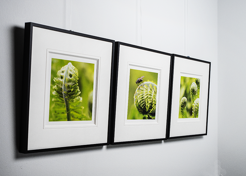
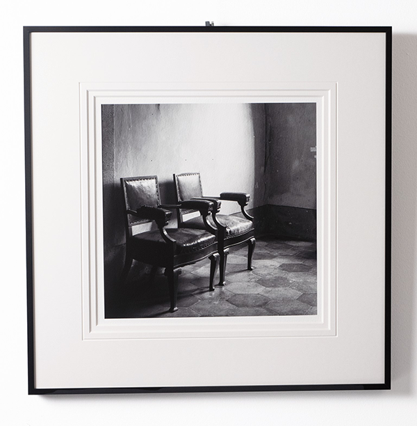
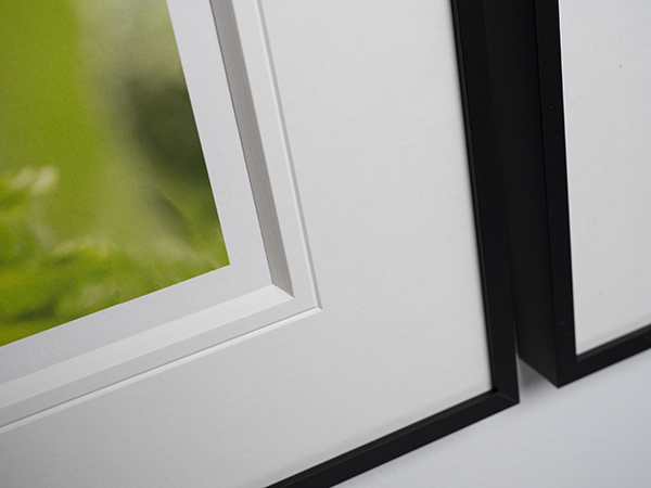
The double or multi-layer Passepartout is one of the most popular and effective forms of decoration. As the name suggests, two or more Passepartouts are layered on top of each other. The bottom Passepartout is produced in the usual way and matched to the image format. Each additional layer has a slightly larger opening, so that a narrow edge of the Passepartout underneath remains visible and a “stepped” effect is created. This extra level creates depth and an even clearer separation between the artwork and the Passepartout. It also offers further design options through a targeted choice of board colours.
Using double or multi-layer Passepartouts can also be very useful when, for example, a Passepartout thickness of 4.1 mm is not sufficient to create enough distance between the exhibit and the glass. For this purpose, it is best to consider thicker Passepartout boards for your double Passepartout.
However, please be sure to note the maximum fill depth of your picture frame intended for the framing. Depending on the number of layers and the selected board thickness, a double or multi-layer Passepartout can quickly exceed this fill depth. To avoid this annoyance, it is best to check the conditions in advance to see which design measures are possible.
Possible colour concepts for your double Passepartout
The visible edge can be kept neutral or deliberately chosen in colour. It often picks up a tone from the artwork, creating a harmonious overall look. In professional framing, this technique is widely used and is considered a classic design element.
Tone on tone
For this colour concept, consider choosing light Passepartout colours such as white and cream tones. Solid-colour boards without a white cut edge are also a suitable choice here.
This type of double Passepartout is very subtle and reveals its full effect especially on closer inspection. Changing light reflections make the different layers stand out in particular. A single Passepartout in this colour looks very classic, while an additional layer gives the framing that certain something.
Subtle colour accents with bold colours
If a coloured Passepartout feels too dominant or does not suit your interior style, choosing a double Passepartout may be a good middle ground for your framing. With this colour concept, you should opt for a rather subtle shade for the top Passepartout. For the lower layer, you can then choose a suitable board from the wide colour palette. Feel free to consider particularly bold colours as well. As a rule, it makes sense to pick up a tone from your artwork or to orient yourself to a suitable colour family in order to create a harmonious overall look.
A colour concept for a multi-layer Passepartout could, for example, be: white-colour-white. Use the configurator to experiment and find a suitable colour combination for your framing.
A touch of gold and silver
With the colours Gold (850-W) and Silver (860-W) from our White Core quality, you can give your framing a very special elegance. To use these very striking colours sparingly, you can create a fine border in gold or silver around the opening with a double Passepartout by choosing a subtle colour for your top board. Bold shades also combine well with metallic colours. In particular, a combination with dark reds, greens and blues can create a very refined effect and convey a stylish calm without appearing boring.
The cut edge as an eye-catcher
Another interesting option is to create a multi-layer Passepartout in dark colours such as dark blue or black. If you choose qualities with a white cut edge, this creates a strong contrast to the Passepartout surfaces and makes the stepped effect of the multiple layers stand out even more clearly. This type of framing is suitable, for example, for very subtle images that nevertheless have a single very striking main motif, often with a very eye-catching colour. On the one hand, the many cut edges are very bold and a real eye-catcher, but at the same time they also draw the viewer’s eye wonderfully to the motif. The multiple—and very pronounced—levels create a very special depth.
These are just a few inspirations for your colour design.
Our Passepartout configurator for custom Passepartouts gives you the option to create a double or multi-layer Passepartout yourself quickly and easily. Under “Advanced options” for your custom Passepartout, you can have additional layers created automatically for your Passepartout. Using the graphic preview to visualise your Passepartout, you can display different colour combinations and choose a suitable option.
Groove cuts – craftsmanship and precision in the details
With a groove cut, a fine, continuous indentation—known as a bevel groove—is made in the Passepartout. Unlike line ruling, the effect is not created by colour, but by light and shadow. The groove highlights the image opening in a very understated way.
The groove cut is a subtle but sophisticated decorative finish, used primarily for high-end single framings or in exhibitions. It underlines the craftsmanship of the framing and looks very premium and elegant. Groove cuts work well with neutral Passepartout colours, with solid-colour boards without a differently coloured core, and also with bold colours with a white core. The effect can vary greatly depending on the board. While a groove cut on neutral Passepartout colours tends to be subtle yet still very enhancing, on stronger colours with a white core it can take on a much more pronounced role. The bevel groove cuts through the surface lamination and reaches the white core, which creates a strong colour contrast to the surface on coloured Passepartouts and picks up the colour of the bevel cut at the opening again. In these cases too, the groove cut looks very premium and elegant, but is also noticeably more present.
Line ruling – subtle structure and classic elegance
Line ruling is a fine, continuous line applied to the Passepartout at a small distance from the image opening. It subtly frames the motif and adds additional structure to the surface. In our shop, you can choose gold or silver for your line ruling.
Depending on the execution, line ruling can
- look very understated and classic
- deliberately set accents, for example through colour or double lines
Line rulings are particularly suitable for works on paper, drawings or photographs where a calm, orderly presentation is desired. They are among the traditional decorative finishes and can be used in many ways.
Embossing – a subtle relief effect for high-end framing
Embossing is an elegant yet unobtrusive finishing technique that makes your Passepartouts unmistakable thanks to an individual touch. Using a metal embossing stamp (a so-called cliché), your logo, company name or signatures can be embossed onto the Passepartout border using a suitable pressure process, giving your Passepartouts a genuine unique selling point compared to standard off-the-shelf Passepartouts. The lines or shapes are worked slightly recessed into the Passepartout. Two different methods can be used, relating to the colour design of the embossing:
Blind embossing
Blind embossing as a decorative finish for Passepartouts is deliberately understated, without distracting from the artwork itself. No colour is used; the Passepartout is simply given a tactile indentation. Especially with changing light, blind embossing reveals its full effect through the interplay of light and shadow.
Colour embossing
With this method, the tactile indentation is combined with colour, making colour embossing appear much more prominent than the blind embossing listed above. Using foil and a heat technique in the embossing machine, the area of your logo or signature is backed in a single colour with the corresponding foil colour during the embossing process. Thanks to this much more eye-catching design, it is a real added value especially for advertising purposes and for recognisability of your artworks and framings. We offer colour embossing in gold, silver and black.
Practical tip: As a rule, embossing is particularly worthwhile for larger quantities and ideally for recurring demand for a specific Passepartout. This is due to the relatively high purchase costs of the cliché and the time-consuming machine setup for individual embossing settings.
Conclusion: Use decorative finishes deliberately
Used correctly, decorative finishes for Passepartouts support your artwork, structure the surface and increase the perceived value of the framing. Double and multi-layer Passepartouts, groove cuts, line rulings and embossing offer versatile ways to customise a Passepartout—from subtle to expressive.
Those who consciously choose a decorative finish create a framing that not only protects, but also presents the artwork effectively and professionally.
The double Passepartout is particularly often used to
- give the artwork more presence
- add subtle colour accents
- achieve a high-end, gallery-like effect
- serve as a clear spacer between the exhibit and the glass